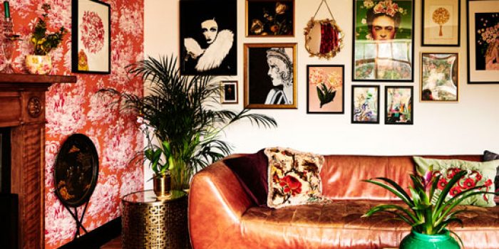
The duo behind destination decor brand Rockett St George have delved into colour in their new book. Gabrielle Fagan takes a look.
Colour has well and truly invaded our homes. In fact, no interiors scheme is complete these days without at least a dash of a punchy shade!
That might sound pretty scary, though, if you’re still clinging to neutrals and quaking at the thought of plunging into the dizzy array of colours on offer.
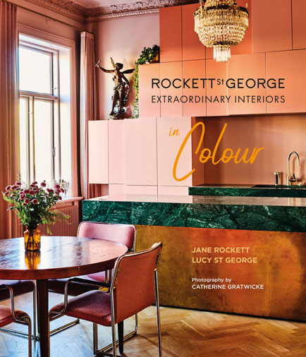
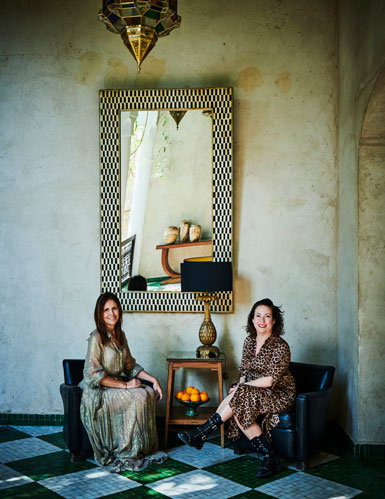
Step forward self-confessed colour-addicts Lucy St George and Jane Rockett, the duo behind chic interiors destination, Rockett St George. They’re on a mission to help us transform our homes with a host of hues, and reveal their secrets and personal inspirations in their new book, Rockett St George: Extraordinary Interiors In Colour.
Colour is emotional, says the pair – “Think peaceful pastels, and sexy reds, creative greens and happy yellows” – and it’s important to consider the meaning of colour and how it affects your emotions, if you want to create a home that feels right for you and harbours the right mood.
Rockett and St George visited homes around the world bursting with bright, bold and brilliant ideas, and looked at the colour rules – and how to break them! – for conjuring successful schemes.
Check out their guide to four of the most fashionable shades for rooms…
Let the sunshine in
“A splash of yellow will catch the eye, set the heart racing and make you smile”, declare the pair. “Yellow’s associated with feelings of joy, optimism, happiness and warmth. It can lift your spirits like a sudden ray of sunshine and is believed to promote clear thinking and quick decision-making.”
Their own favourite shade on the yellow spectrum is mustard, which they describe as “an earthy hue that’s both sophisticated and a wonderful way to inject an uplifting spirit into your home”.
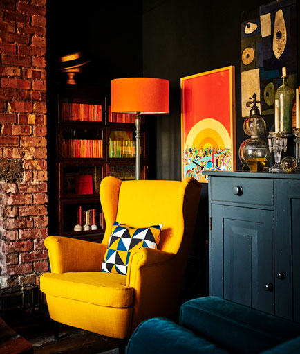
Work the colour: Black can make a perfect neutral backdrop for strong colours like yellow or orange. “It makes them pop and allows furniture, textiles and artwork to shine through and become the stars of the show,” they explain.
If bold sunny shades seem too vibrant and make you want to reach for your sunglasses, consider opting for more subtle sandy-yellow shades as an alternative to creams.
Considering the effect of light on colour is also key, they caution. For instance, a cool-toned lemon yellow can feel hard and unwelcoming in the colder light of a north-facing room, making it more suitable for south-facing rooms.
Lighten the mood with a flash of yellow
Yellow accessories pack a punch, and Rockett and St George note how a yellow chair or piece of art “brings energy to a room without overwhelming it”.
Seduce with pink
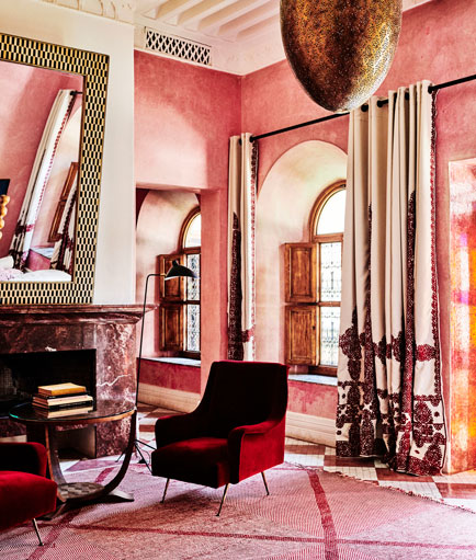
Pinks are enjoying huge popularity in decor right now – particularly the soft, pale tones. “The gentler shades of pink encourage calmness and love, while stronger shades, such as hot pink, go hand in hand with feelings of joyfulness and creativity,” enthuse the duo.
Our passion for pink is nothing new, they point out, as the shade has been a constant favourite as a decorative choice throughout the decades, from ice-cream pastel pinks in the Fifties, to the hot pinks of the Eighties.
Rockett and St George took inspiration from earthy pinks characteristic of Moroccan homes for the pink shades in their paint collection for Craig & Rose. Their nude/pink shades include Broderie, Gladstone Grey and Bohemia (Chalky Emulsion Paint, £35 for 2.5L).
Work the colour: For living rooms and bedrooms, the duo recommend “nude and pale pinks with warm undertones to make you feel nurtured and safe”. Work or studio spaces, meanwhile, are the perfect place to experiment with “brighter pinks, which are flamboyant and expressive, ideal for creating impact”.
Sizzle with pops of pink
Declare your passion for the colour with the prettiest pink pieces that will take you from hot to blushing…
Go green and gorgeous
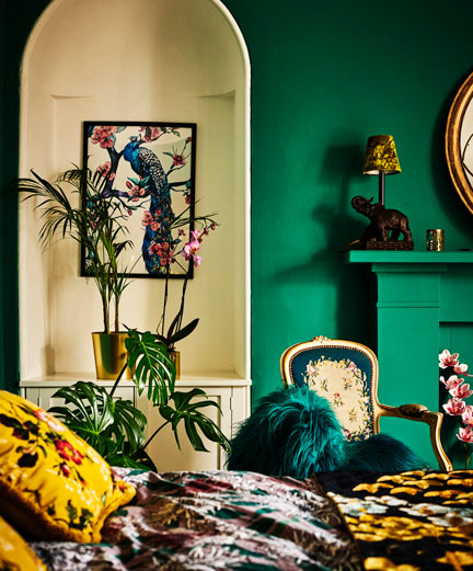
“Green is fabulously versatile. Whether you prefer soft sage, rich emerald or deep forest green, this crowd-pleaser of a colour can be adapted to suit just about any style of interior,” the decor-lovers declare.
Green is said to evoke feelings of balance, tranquillity and renewal, and studies have shown that it’s the most restful colour for the human eye. It’s totally synonymous with the ‘green’ movement and eco initiatives that are on the rise right now too.
Work the colour: Dark greens work wonders in living rooms and bedrooms, or anywhere else in the home where you want to relax and have “a little respite”, advise the colour gurus. “Brighter punchier greens are perfect for energising a busy area such as the kitchen or hallway,” they also suggest. “Green accents in the shape of plants or cacti will bring your decor to life and – added bonus – act as a natural air-refresher for the home.”
Bring on the balance with a touch of green
Green accessories can add a sophisticated touch and enhance those soothing vibes…
Dive into blue
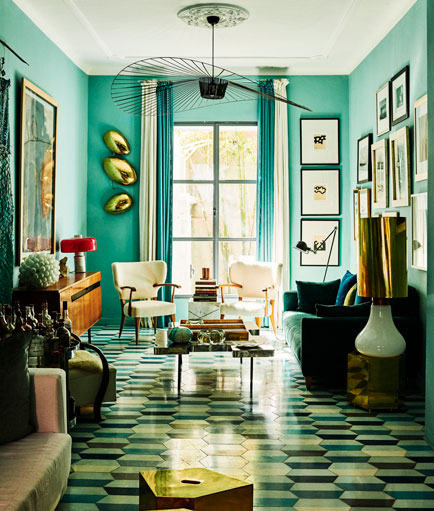
“Blue is the coolest of all the colours in the spectrum and conjures up feelings of reliability and stability,” says Rockett. “Due to its associations with nature – think of clear summer skies and turquoise ocean – blue can also inspire feelings of serenity and contentment.”
Blue, she points out, is a stress-busting colour with a masculine edge (a recent study found that 42% of men chose blue as their favourite colour), but that doesn’t mean blue is just for boys, of course!
Work the colour: Bold blues, the pair suggest, particularly suit home offices, children’s playrooms, hallways and bathrooms. Darker blues project a sense of sophistication and tranquillity, and can work as the perfect backdrop for art collections and decorative displays.
Splash out on blue details
Give your space a stress-busting edge with one or two blue buys…
Extracted from Rockett St George: Extraordinary Interiors In Colour by Jane Rockett and Lucy St George, photography by Catherine Gratwicke, published by Ryland Peters & Small, priced £19.99. Available now.

